
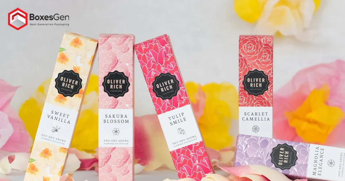
 Mylar Bags
 Custom Labels
 Custom Sticker
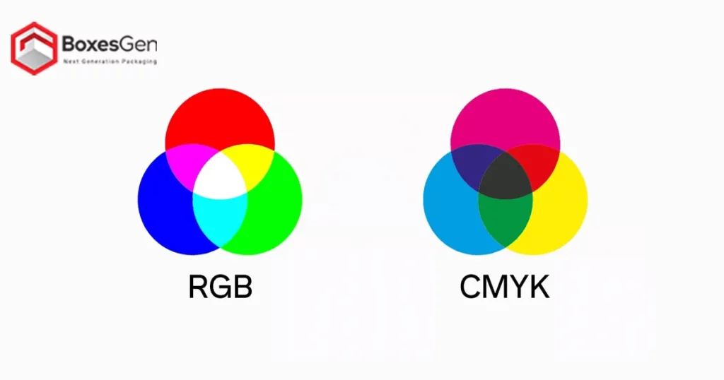
On the subject of Graphic Design and printing, choosing the right color model is crucial to achieving vibrant and accurate results. Two widely used color models for printed designs, especially in packaging, are RGB (Red, Green, Blue) and CMYK (Cyan, Magenta, Yellow, Key/Black). Each model serves a distinct purpose, and understanding their differences is essential for designers and businesses alike.
RGB Color Model
The RGB color model is primarily used for electronic displays, such as computer monitors, television screens, and digital devices. It is an additive color model, combining various intensities of red, green, and blue light to create a broad spectrum of colors. RGB is ideal for designs intended for screens and online platforms due to its ability to produce a wide range of vibrant and saturated colors. However, when it comes to printing, RGB can pose challenges, as it may not accurately represent colors on paper.
CMYK Color Model
Contrastingly, the CMYK color model is a subtractive color model designed for printing applications, including Packaging designs. CMYK uses four ink plates – Cyan, Magenta, Yellow, and Key/Black (CMYK) – to create a full spectrum of colors. This model is more suitable for print because it reflects the subtractive nature of color mixing, which occurs when pigments are layered. Unlike RGB, CMYK is better at reproducing colors on paper, making it the preferred choice for printed materials like packaging, brochures, and Labels.
Key Differences Between RGB and CMYK
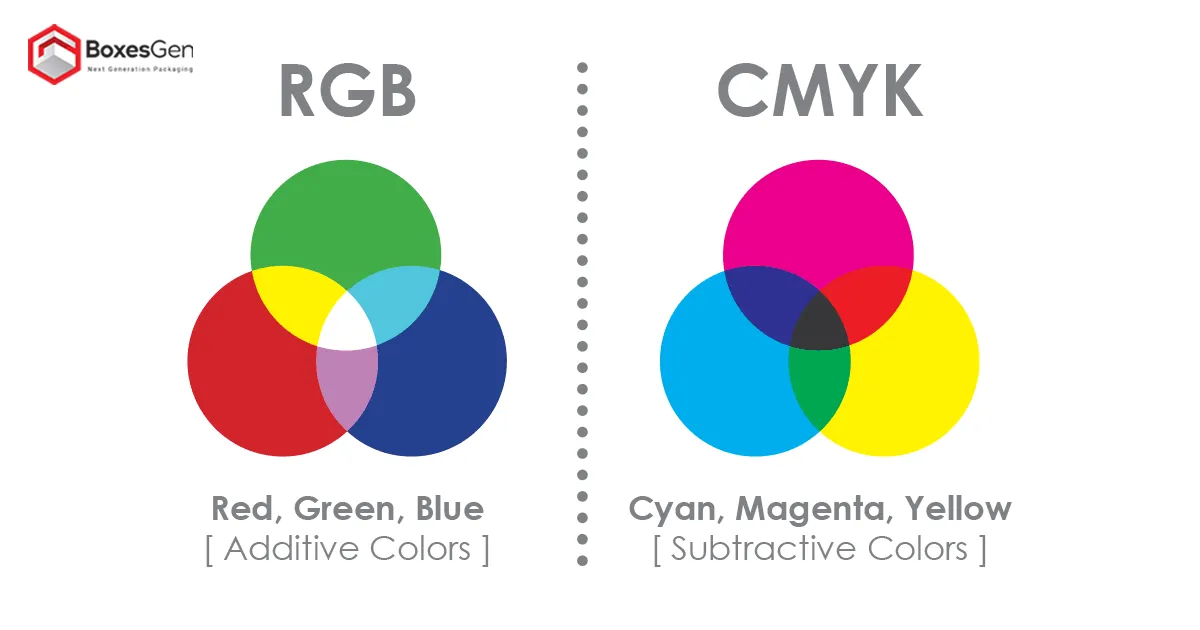
1. Color Range
- RGB has a wider color gamut, suitable for electronic displays.
- CMYK has a more limited color range but is optimized for print accuracy.
2. Additive vs Subtractive
- RGB is an additive model, combining light to create colors.
- CMYK is a subtractive model, mixing pigments to achieve colors.
3. Output Medium
- RGB is ideal for digital platforms and screens.
- CMYK is the standard for printed materials like packaging.
Importance of Choosing the Right Color Model
Selecting the appropriate color model is crucial to ensure that the final printed design accurately represents the intended colors. Misusing RGB for print may result in color variations, as the RGB color space often exceeds the capabilities of printing inks. To avoid disappointment and achieve consistency in packaging designs, it’s essential to work in the CMYK color mode from the initial design stages.
Conversion Challenges and Solutions
Designers may face challenges when converting RGB designs to CMYK, as certain vibrant RGB colors may not have direct CMYK equivalents. This can lead to color shifts and undesired variations. To mitigate this, designers should use color management tools and adjust color settings during the conversion process. Regularly proofing designs in CMYK ensures that any necessary adjustments are made before finalizing the printing process, maintaining color accuracy.
Considerations for Packaging Designs
When creating packaging designs, it’s crucial to consider various factors that influence color representation and printing outcomes. Some key considerations include:
1. Material and Finish
- Different packaging materials and finishes can impact how colors appear.
- Matte finishes may absorb more ink, affecting color vibrancy, while glossy surfaces can reflect light differently.
2. Printing Technology
- The type of printing technology used, such as offset or digital printing, can influence color accuracy.
- Understanding the capabilities of the chosen printing method helps in optimizing designs accordingly.
3. Brand Consistency
- Maintaining consistency in brand colors across various print materials is vital for brand identity.
- Designers should work with a standardized color palette to ensure uniformity in packaging and promotional materials.
Pantone and Spot Colors
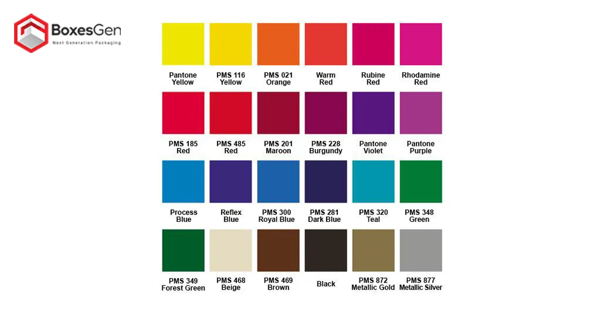
In addition to the RGB and CMYK color models, another crucial aspect of color management in printed designs involves the use of Pantone Matching System (PMS) colors and spot colors. PMS is a standardized color reproduction system that assigns unique codes to specific colors, allowing for consistent color reproduction across various materials. Spot colors, often derived from the Pantone color palette, involve the use of premixed inks to achieve precise and consistent colors. This method is particularly popular in branding, where maintaining a company’s signature colors is paramount.
1. PMS and Branding
- Many brands rely on PMS colors for their logos and brand identity.
- PMS ensures uniformity in color across different printed materials, reinforcing brand recognition.
2. Spot Colors in Printing
- Spot colors are advantageous for projects requiring specific color accuracy.
- Designers can use spot colors to achieve unique effects or reproduce colors that may be challenging with traditional CMYK printing.
The Impact of Color Psychology in Packaging Designs
Beyond technical considerations, the psychological impact of colors plays a significant role in packaging design. Different colors evoke specific emotions and perceptions, influencing consumer behavior. For example:
1. Red
- Evokes excitement, passion, and energy.
- Often used to grab attention and create a sense of urgency, making it popular in sales and promotional packaging.
2. Blue
- Represents trust, calmness, and professionalism.
- Frequently used in packaging for technology, healthcare, and beauty products.
3. Green
- Symbolizes nature, health, and freshness.
- Commonly seen in packaging for organic or eco-friendly products.
4. Yellow
- Conveys warmth, optimism, and positivity.
- Effective in drawing attention and creating a cheerful atmosphere.
Understanding the psychological impact of colors allows designers to strategically use them in packaging designs to influence consumer perceptions and enhance brand messaging.
Sustainable Printing Practices
As the global focus on sustainability grows, the printing industry is also adapting to eco-friendly practices. Designers and businesses are increasingly opting for sustainable printing methods and materials, impacting color choices and design decisions. Some considerations include:
1. Recyclable Inks
- Eco-friendly, vegetable-based inks are gaining popularity.
- These inks reduce the environmental impact and are easily recyclable, aligning with sustainable printing practices.
2. Biodegradable Packaging
- Packaging Materials made from recycled or biodegradable materials contribute to environmental conservation.
- Designers need to consider how colors interact with these materials to maintain visual appeal while prioritizing sustainability.
3. Minimalist Design Trends
- Minimalist packaging designs with fewer colors and simple graphics are on the rise.
- Such designs not only align with sustainability goals but also communicate a sense of transparency and simplicity to consumers.
Future Trends in Color Management
As technology evolves, color management in the printing industry continues to advance. With the rise of digital printing and the demand for high-quality visuals, there is a growing emphasis on color accuracy and efficiency. Some emerging trends include:
1. Expanded Color Gamut’s
- Advances in printing technologies are pushing the boundaries of color reproduction.
- New ink formulations and printing processes aim to achieve even more extensive color gamut’s, bridging the gap between RGB and CMYK.
2. Machine Learning in Color Correction
- Machine learning algorithms are being employed for automated color correction.
- These systems can analyze and adjust colors in real-time, enhancing efficiency and reducing manual intervention.
Conclusion
The choice between RGB and CMYK color models significantly impacts the final outcome. While RGB excels in digital platforms, CMYK remains the go-to model for packaging and other printed materials. Designers must understand the differences, potential challenges, and employ best practices to ensure accurate and visually appealing results. As technology continues to evolve, staying informed about emerging trends in color management is essential for those seeking to stay at the forefront of the graphic design and printing industries.