
 Mylar Bags
 Custom Labels
 Custom Sticker
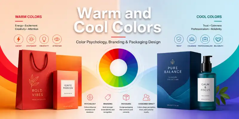
Color is one of the first things customers notice when they look at a product. Before they read the label, check the ingredients, compare features, or understand the price, they respond to the visual feeling created by the packaging. In a competitive USA market where products compete on retail shelves, online marketplaces, and social media feeds, color can influence whether a customer stops, clicks, remembers, or buys.
In packaging design, color is more than decoration. It communicates brand personality, product category, quality level, emotional tone, and customer expectations. A bold orange box may feel energetic and exciting. A soft blue package may feel calm, clean, and trustworthy. A luxury black box with gold accents may suggest premium value, while a natural kraft box with green details may support an eco-friendly message.
For designers, e-commerce brands, and packaging buyers, understanding warm and cool colors is essential. The right color palette can strengthen branding, improve shelf appeal, support color psychology, and make custom boxes more effective as marketing tools. The wrong color choice can confuse customers, weaken brand recognition, or create printing issues that affect the final presentation.
| Aspect | Warm Colors in Packaging | Cool Colors in Packaging |
|---|---|---|
| Visual Style | Bold, energetic, bright, and attention-grabbing | Clean, calm, fresh, and professional |
| Color Examples | Red, orange, yellow, coral, peach, gold, and warm brown | Blue, green, teal, purple, mint, navy, and cool gray |
| Customer Feeling | Excitement, appetite, urgency, comfort, and friendliness | Trust, freshness, calmness, safety, and confidence |
| Best Packaging Use | Food boxes, bakery packaging, kids’ product boxes, cosmetic boxes, and promotional packaging | Skincare boxes, healthcare packaging, supplement boxes, tech boxes, and eco-friendly packaging |
| Brand Message | Creative, active, cheerful, bold, and high-impact | Reliable, premium, natural, clean, and professional |
| Buyer Influence | Helps products stand out quickly on retail shelves and online listings | Builds confidence and makes packaging feel polished and trustworthy |
| Printing Tip | Use strong contrast so logos, product names, and details remain easy to read | Pair with matte coating, white space, foil stamping, or clean typography for a premium look |
| Best For USA Brands | Brands that want stronger visibility, seasonal appeal, and energetic packaging design | Brands that want trust, quality, sustainability, and a refined packaging presentation |
What Are Warm Colors?
Warm colors are colors that visually feel active, energetic, bright, and emotionally stimulating. They are usually associated with heat, sunlight, fire, excitement, comfort, and urgency. The main warm colors include:
- Red
- Orange
- Yellow
- Warm pinks
- Warm browns
- Gold tones
- Some peach and coral shades
In packaging design, warm colors are often used when a brand wants to create attention, appetite, excitement, warmth, or a sense of bold personality.
Red in Branding and Packaging
Red is one of the most powerful colors in marketing. It creates urgency, passion, energy, and appetite. Many food, beverage, snack, and promotional packaging designs use red because it stands out quickly and encourages action.
For example, red packaging can work well for spicy food products, candy boxes, limited-edition retail packaging, Valentine’s Day gift boxes, and bold cosmetic packaging. In custom boxes, red can help a product feel confident and high-impact, especially when paired with white, black, or metallic accents.
However, red should be used carefully. Too much red can feel aggressive or overwhelming, especially for wellness, skincare, or premium lifestyle products where calmness and trust are important.
Orange in Packaging Design
Orange combines the energy of red with the friendliness of yellow. It feels youthful, creative, warm, and approachable. Orange is commonly used for food packaging, sports products, subscription boxes, kids’ products, and brands that want to appear fun and modern.
For USA e-commerce brands, orange can be a strong choice for custom mailer boxes, promotional packaging, and seasonal campaigns. It creates a memorable unboxing experience and performs well in digital product photography because it appears vibrant and energetic.
Orange also works well as an accent color. A black box with orange details can feel premium, bold, and contemporary, while a white box with orange typography can feel clean and cheerful.
Yellow in Print Design
Yellow is associated with optimism, freshness, clarity, and happiness. In packaging design, yellow can attract attention quickly, especially on crowded shelves. It is often used for snacks, bakery items, children’s products, summer-themed packaging, and bright retail displays.
The challenge with yellow is print readability. Light yellow text on white or kraft packaging may be difficult to read. Designers should use strong contrast and test yellow shades carefully in CMYK or Pantone printing before final production.
What Are Cool Colors?
Cool colors feel calm, stable, fresh, clean, and professional. They are often associated with water, sky, nature, health, technology, trust, and relaxation. The main cool colors include:
- Blue
- Green
- Purple
- Teal
- Cool gray
- Mint
- Navy
- Lavender
In packaging design, cool colors are often used when brands want to communicate trust, freshness, wellness, elegance, or sophistication.
Blue in Packaging and Branding
Blue is one of the most trusted colors in branding. It often represents reliability, cleanliness, intelligence, and professionalism. This is why blue is widely used in healthcare, technology, personal care, supplements, corporate packaging, and financial branding.
For packaging buyers, blue is a practical color when the product needs to feel safe, dependable, or premium without being too loud. A navy blue rigid box can look high-end, while a light blue skincare box can feel gentle and refreshing.
In the USA market, blue packaging is especially effective for products where trust is a major buying factor, such as wellness products, medical packaging, electronics, grooming products, and clean beauty items.
Green in Eco-Friendly Packaging
Green is strongly connected with nature, sustainability, freshness, health, and organic products. Many eco-conscious brands use green packaging to show that their products are natural, recyclable, plant-based, or environmentally responsible.
Green works well on kraft boxes, food-grade packaging, cosmetic boxes, supplement packaging, and natural soap boxes. When paired with earthy tones, green can create a calm and sustainable brand image. When paired with white, it can feel fresh and clean.
However, brands should avoid using green only as a visual trick. If packaging claims or suggests sustainability, the material choices should support that message. Customers in the USA are increasingly aware of greenwashing, so eco-friendly colors should match real packaging decisions such as recyclable paperboard, soy-based inks, or minimal material waste.
Purple in Premium Packaging
Purple often communicates creativity, luxury, mystery, and elegance. It is common in beauty packaging, fragrance boxes, gift packaging, candle boxes, and premium retail products.
A deep purple box with foil stamping can feel luxurious. A soft lavender package can feel calming and feminine. Purple is especially useful when a brand wants to stand apart from common black, white, or neutral packaging while still maintaining a premium look.
Psychological Impact of Colors in Marketing
Color psychology studies how colors influence emotion, perception, and behavior. In packaging and branding, color does not control customers completely, but it does shape their first impression.
A customer may not consciously think, “This blue box makes me trust this brand.” Instead, they may simply feel that the product looks clean, reliable, and professional. That feeling can influence whether they pick it up, click on it, or compare it favorably against competitors.
How Warm Colors Influence Buyers
Warm colors often create movement and emotional energy. They can make packaging feel exciting, bold, appetizing, or urgent. This is useful for:
- Food and beverage packaging
- Promotional product boxes
- Seasonal campaigns
- Kids’ packaging
- Sports and fitness products
- Bold cosmetic brands
- Retail display packaging
Warm colors are also effective when a product needs strong shelf visibility. Red, orange, and yellow can quickly attract the eye, making them valuable for competitive retail environments.
How Cool Colors Influence Buyers
Cool colors often create calmness, confidence, and trust. They are useful for products where customers want reassurance, quality, or a clean experience. Cool colors are commonly used for:
- Skincare packaging
- Healthcare and wellness products
- Tech accessories
- Organic and natural products
- Luxury gift boxes
- Corporate packaging
- Subscription packaging
Cool tones can also make packaging feel more premium when paired with minimal typography, matte coatings, embossing, debossing, or foil stamping.
Warm vs Cool Colors in the Packaging Industry
Warm and cool colors serve different branding goals. Neither is better than the other. The best choice depends on the product, audience, price point, and brand message.
Warm Colors Create Attention
Warm colors are often better for products that need to stand out quickly. A snack brand, promotional gift box, or energetic beauty product may benefit from warm tones because they create visual excitement.
For example, a bakery box with warm orange, cream, and brown tones may create a fresh, comforting, and appetizing impression. A red cosmetic box may feel bold and glamorous. A yellow subscription box may feel cheerful and fun.
Cool Colors Build Trust
Cool colors are often better for products that need to feel calm, reliable, natural, or refined. A skincare brand may choose soft blue or sage green to communicate freshness and care. A tech accessories brand may use navy or silver-blue to look modern and dependable.
For example, a supplement box with green and white packaging can suggest wellness and clean ingredients. A premium candle box with deep blue and gold foil can create a luxury experience.
Balanced Palettes Can Be Powerful
Many successful packaging designs use both warm and cool colors together. The key is balance. A brand may use a cool color as the main background and a warm color as an accent for calls to action, product flavor, or limited-edition details.
For example, a white and navy box with orange accents can feel trustworthy but energetic. A kraft box with green branding and warm gold foil can feel natural yet premium.
How Brands Use Color to Influence Buyers in the USA Market
The USA packaging market is highly visual and competitive. Customers discover products in grocery stores, boutiques, Amazon listings, TikTok videos, Instagram posts, and direct-to-consumer websites. Packaging color must perform both physically and digitally.
Retail Shelf Impact
In physical stores, color helps products compete for attention. Warm colors can attract quick visibility, while cool colors can create a cleaner and more premium shelf presence. A product’s color palette should also fit the category while offering enough difference to be noticed.
For example, many organic products use green, white, and kraft tones. A brand can still use that language while adding a unique secondary color, custom illustration style, or premium finish to stand out.
E-Commerce Photography
For online brands, packaging color must photograph well. Some colors appear differently under studio lights, phone cameras, or marketplace image compression. Bright warm colors may look attractive but can become oversaturated. Cool colors may look premium but can appear dull if the contrast is weak.
This is why color-accurate printing and professional proofing are important. A brand should not choose colors only from a screen. Packaging colors should be tested through digital proofs, physical samples, or Pantone references when color accuracy matters.
Unboxing Experience
In e-commerce, packaging is often the first physical brand touchpoint. A custom box color can make the unboxing experience more memorable. Warm colors can create excitement, while cool colors can create calm luxury.
Interior printing also matters. A simple outside with a bold inside color can surprise customers and improve social sharing. For example, a minimal white exterior with a warm orange interior can feel clean but energetic. A matte black exterior with a cool blue insert can feel sleek and premium.
Best Practices for Choosing Packaging Colors
Choosing packaging colors requires both creativity and strategy. A beautiful color palette is not enough if it does not support the brand, product, customer, and printing process.
1. Start With Brand Personality
Before choosing colors, define the brand personality. Is the brand bold, playful, luxurious, natural, clinical, modern, or handcrafted? Warm colors usually support energy and excitement. Cool colors usually support trust and calmness.
A children’s snack brand may need bright warm tones. A premium skincare line may need soft cool tones. A luxury fragrance brand may need deep, rich colors with metallic finishes.
2. Understand the Target Customer
Packaging should appeal to the actual buyer. A USA-based fitness brand targeting young adults may use energetic warm accents. A wellness brand targeting professionals may choose cooler, more refined colors.
The goal is not to pick a personal favorite color. The goal is to choose a color system that helps the right customer understand the product quickly.
3. Consider Product Category Expectations
Every product category has visual expectations. Food packaging often uses warm, appetizing colors. Healthcare products often use clean blues, whites, and greens. Luxury packaging often uses black, navy, burgundy, purple, or metallic tones.
Brands can break category rules, but they should do it intentionally. If the packaging looks too different from what customers expect, it may create confusion.
4. Use Contrast for Readability
Good print design requires readable text. Product names, ingredients, instructions, warnings, and branding details must be clear. Low contrast color combinations may look stylish on a screen but fail in real packaging.
Avoid light text on light backgrounds, dark text on dark backgrounds, and overly busy patterns behind important information. Strong contrast improves both design quality and customer trust.
5. Match Colors With Materials and Finishes
The same color can look different on kraft, white cardboard, rigid stock, corrugated board, or coated paperboard. Matte lamination can soften colors. Gloss coating can make colors appear brighter. Foil stamping, spot UV, embossing, and debossing can change how customers experience the color.
For accurate custom boxes, color choices should be reviewed with the material and finish in mind.
6. Use Print Standards
Professional packaging printing often requires CMYK values, Pantone Matching System references, or color proofs. RGB colors on a computer screen may not print exactly the same. This is especially important for brand colors used across websites, labels, boxes, and marketing materials.
Color-accurate printing helps maintain brand consistency across every customer touchpoint.
Common Mistakes in Color Selection for Packaging
Even strong brands can make color mistakes if they focus only on appearance and ignore strategy or print production.
Choosing Colors Without a Brand Strategy
A color may look beautiful but still be wrong for the product. For example, a bright red box may not fit a calming sleep wellness product. A pale blue box may not create enough appetite appeal for a bold snack brand.
Color should support the message, not fight it.
Ignoring Printing Differences
Colors on screens are not always the same as printed colors. This is a common issue for new brands ordering custom packaging for the first time. A color may look vibrant in a digital mockup but appear darker, lighter, or less saturated when printed.
To avoid this, businesses should work with packaging printers that understand color management, proofing, and material behavior.
Using Too Many Colors
A crowded color palette can make packaging look cheap or confusing. Premium packaging often uses fewer colors with stronger control. Limiting the palette helps customers focus on the brand name, product type, and key message.
Poor Contrast and Small Text
Packaging is not only visual; it is functional. Customers need to read product details easily. Low contrast text, tiny fonts, and busy backgrounds can reduce trust and create a poor user experience.
Following Trends Without Thinking Long Term
Trendy colors can help seasonal campaigns, but core brand packaging should be built for long-term recognition. If a brand changes colors too often, customers may struggle to recognize the product.
Use Color as a Packaging Strategy, Not Just Decoration
Warm and cool colors play a major role in packaging design, color psychology, branding, and print design. Warm colors can create energy, appetite, attention, and excitement. Cool colors can create trust, calmness, freshness, and premium appeal. The best packaging colors are chosen with purpose, tested for print accuracy, and aligned with the brand’s customer, product category, and market position.
For USA businesses, packaging color must work across retail shelves, e-commerce listings, unboxing experiences, and social media visuals. A strong color palette can help custom boxes become more than containers. It can turn packaging into a branding asset that communicates quality before the customer even opens the box.
BoxesGen helps brands bring that strategy to life with custom packaging solutions designed for professional presentation and market impact. From color-accurate printing to branding-focused design support, BoxesGen works with businesses that need high-quality packaging for retail, e-commerce, cosmetics, food, gifts, apparel, and more. Whether you want warm colors that grab attention or cool colors that build trust, BoxesGen can help you create custom boxes that look polished, print accurately, and support your brand in the USA market.