
 Mylar Bags
 Custom Labels
 Custom Sticker
 Tube Packaging
What Is Color Black In Printing?
When you are getting ready to print your artwork in full color, make sure you use pure black for any text in your design. Full-color printing uses four colors – cyan, magenta, yellow, and black (also known as CMYK). Using pure black makes your text look sharp and clear. When an image is printed, it’s made up of tiny dots of color, just like how digital images are made up of pixels. If a web image doesn’t have enough pixels per inch (PPI), it can look blurry when you try to make it bigger.
Let’s Talk About the Color Black
Black is the darkest color because it absorbs all light and doesn’t reflect any. In theory, a black hole is the perfect example of black because its gravity is so strong that light can’t escape. But in real life, nothing is perfectly black. We say something is ‘black’ when it doesn’t reflect light. That’s why it’s hard to get a good black color on an LCD screen. Even when a pixel is turned off, the screen is still lit from behind, which makes the black look more like gray.
Type of Different Black color?
There are several types of black CMYK for printing. Here are a few:
Standard Black
This standard black color is a pure black color mainly used for black text. This color is 100 percent based on pure black without a mixture of any other color. The regular value of pure black color. The regular black color is mostly used for large areas like in the background to give your packaging a more attractive look you can further add ink for a different touch to deepen the black further!
Heavy Black
If you want to make the standard black color more vibrant yoi can mix colors including cyan, yellow, and magenta that can help it deepen and a richer black. More often, designers make a very silly mistake when they add 100 value of these three colors just to match the standard black color. In the end, it becomes weak and you can’t rectify it on an immediate basis!
First, if you use all four colors completely, it uses a lot of ink. So, the person operating the printing press has to slow it down. This makes sure the ink spreads evenly and doesn’t go in the wrong places. Because of this, the printing job takes more time to dry, and this can delay delivery.
Using too much ink can also cause problems when the document is finished. It can leave marks and make the paper wavy, which makes it harder to put the document together at the binding stage. Another issue is that thin white letters in the artwork can get filled in as the ink spreads on the paper, making the text hard to read. So, it’s best not to use all colors completely for solid backgrounds.
Registration Blacks
The final type of color of black is registration black which carries 100% values of all color values. If your designer is not using it correctly you are missing on big!
These are the few rules that you have to keep it in mind including:
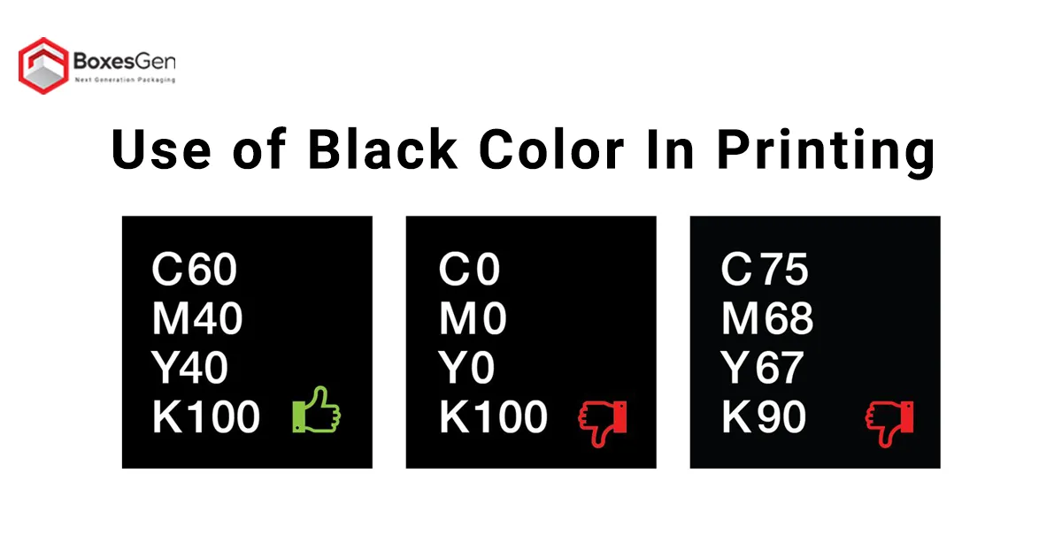
When you see 100% K, it’s just for writing.
If you want a deep black color, use a mix of 30% C, 30% M, 30% Y, and 100% K.
If all CMYK colors are at 100%, it’s called registration black and is only used for printer marks.
When to Use Rich Black
Use rich black when you have a big area that needs a lot of black or has a black background. It’s also good for things like leaflets, brochures, posters, or large fonts. If you have a light background and want a dark color on top for contrast, rich black is a good choice. Sometimes, a printer might mix regular black with the background, letting the background show through. Rich black solves this problem and gives you a bold, true black.
When to Avoid Using True Black
Rich black isn’t always the best choice. Avoid it when you’re working with small black areas or small text. Also, don’t use rich black with newspapers. It can bleed on newsprint and damage the paper.
Final Words
To sum it up, using black in printing is more than just picking a dark color. It’s about choosing the right kind of black. For clear, sharp words, we use standard black (100% K). When we need a bold, deep black for big areas, we use a mix called rich black. This mix stops the background from peeking through and makes sure the black stands out against lighter colors. But, rich black isn’t always the best. It’s not good for small text or newspapers because it can smudge and ruin the paper. So, knowing which black to use and when can really make your printing work look great. Even though it might seem simple, choosing the right black is a big deal in printing.
Related Article
Need Help? Call Our Team At (302) 778-9458
Need Help with BoxesGen Packaging Consultant? We're here! We offer a variety of packaging options, from sustainable choices to personalize packaging, all aimed at helping your product stand out. And with our fast turnaround, you can get started without the wait.
Ask For Help